A unified framework for all visual elements used in trade executions.
A collection of MHA most notable projects and achievements.
An entrepreneur, family man, and believer in living life to the fullest.
Hearing Aid information, usage instructions & guidelines
MHA Cebu grand opening campaign promo
MHA Electronic Direct Mail (EDM) campaign
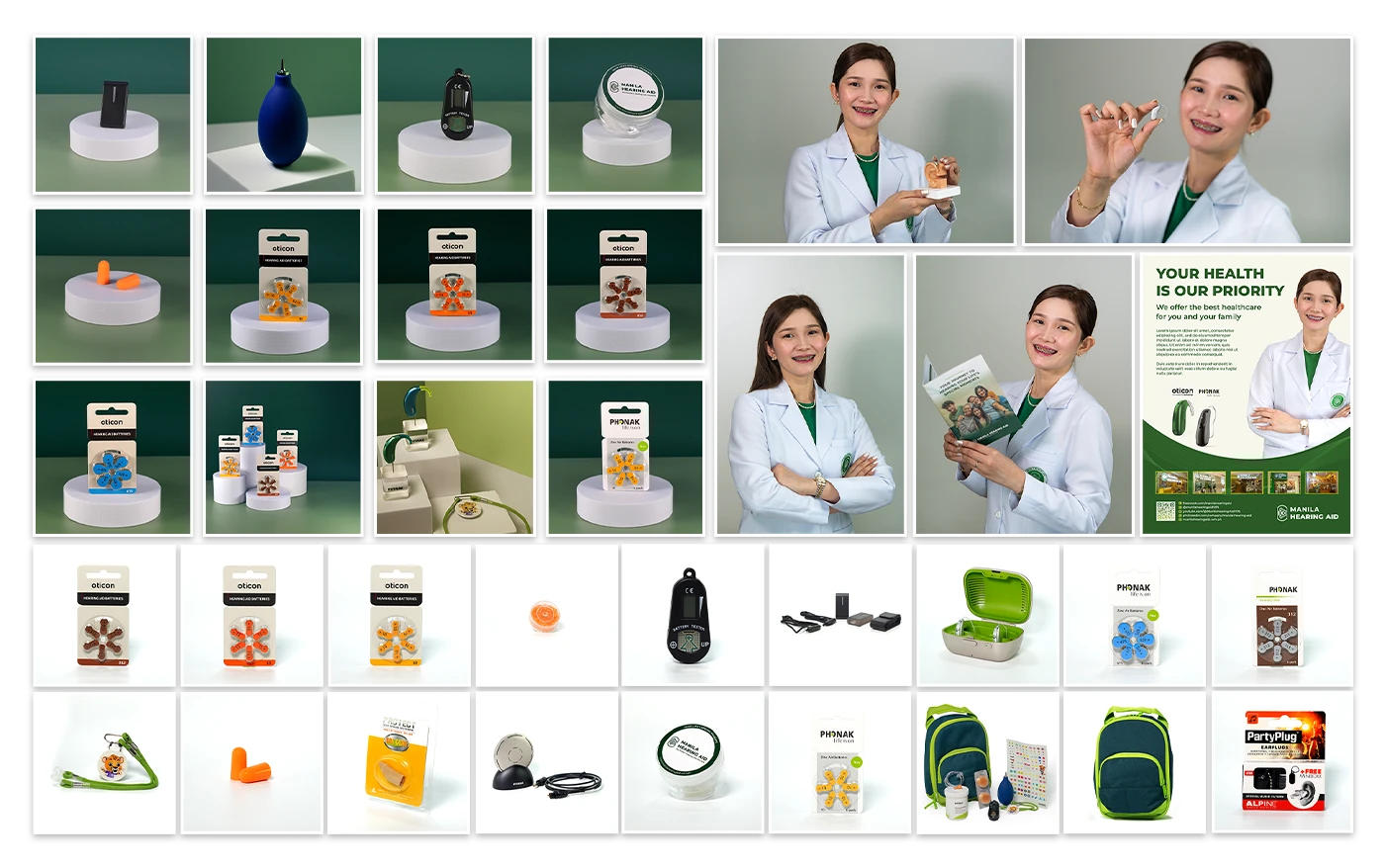
Product photography for various campaigns
Story Of How Dreams Come True
Redesigned and updated brand identity guidelines
A documentary-style video about a patients hearing journey.
Christmas campaign for premium hearing care multi-channel ads
XBISTRO Laboratory’s restaurant ad featuring Krizzle Luna.
XBistro special promo and menu
A short interview with a legal expert for social media content.
A Short clip for social media content.
One Korea, a peaceful movement promoting reunification of the Korean peninsula
An online typing-learning platform website.
Designed and improved the wikiHow website article page
online yoga brand targeting mothers of all ages
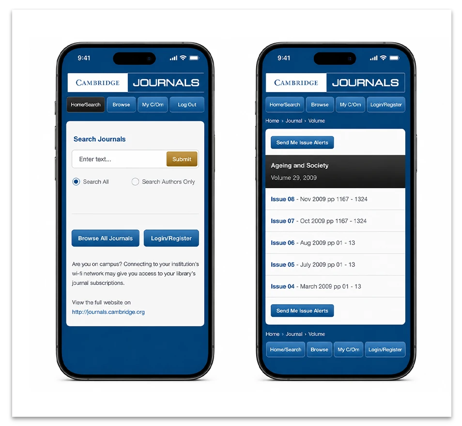
Mobile version of the Cambridge Journals website
OVERVIEW
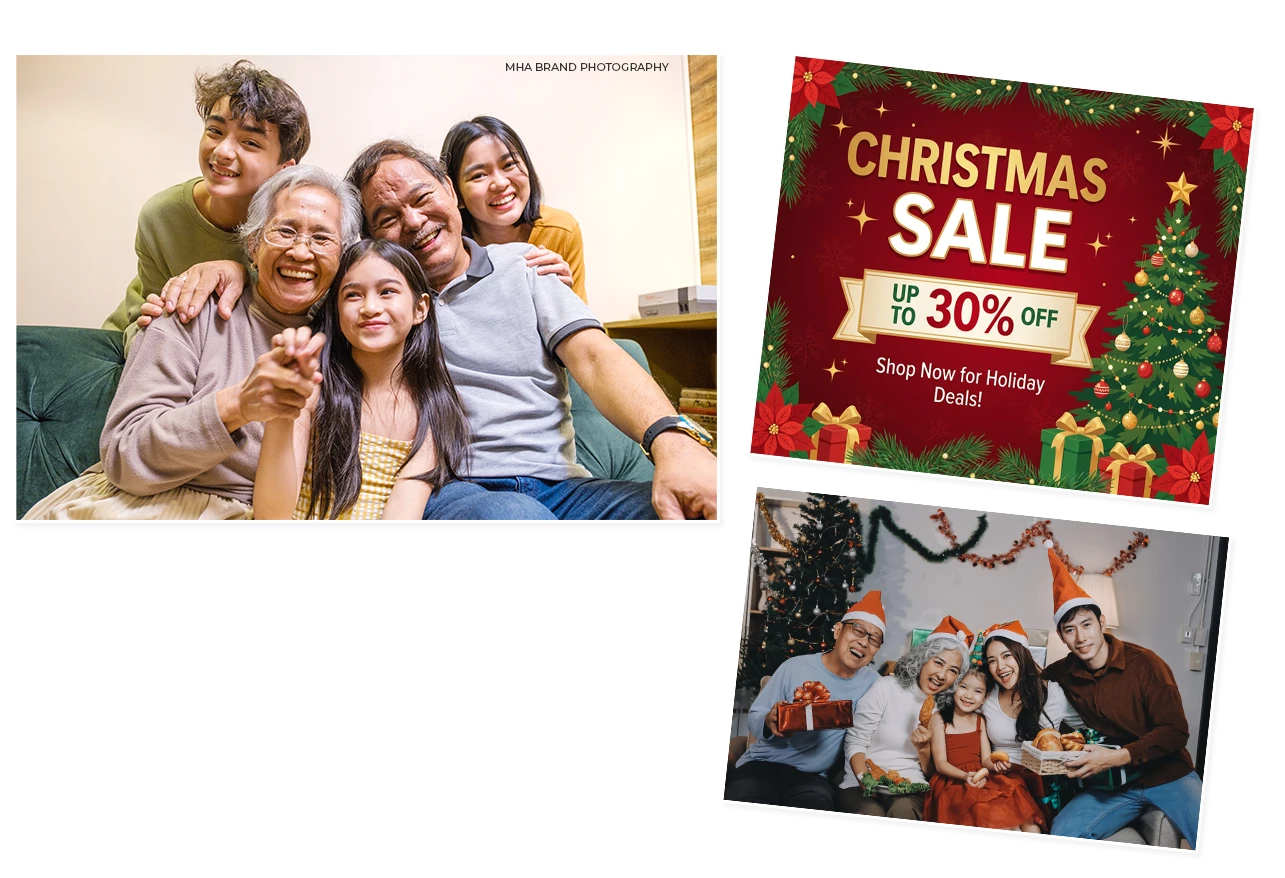
Designed a Christmas campaign for premium
hearing care focused on emotional storytelling
rather than product-focused advertising, using
lifestyle brand imagery to represent the idea of
“Hear life’s special moments.” →
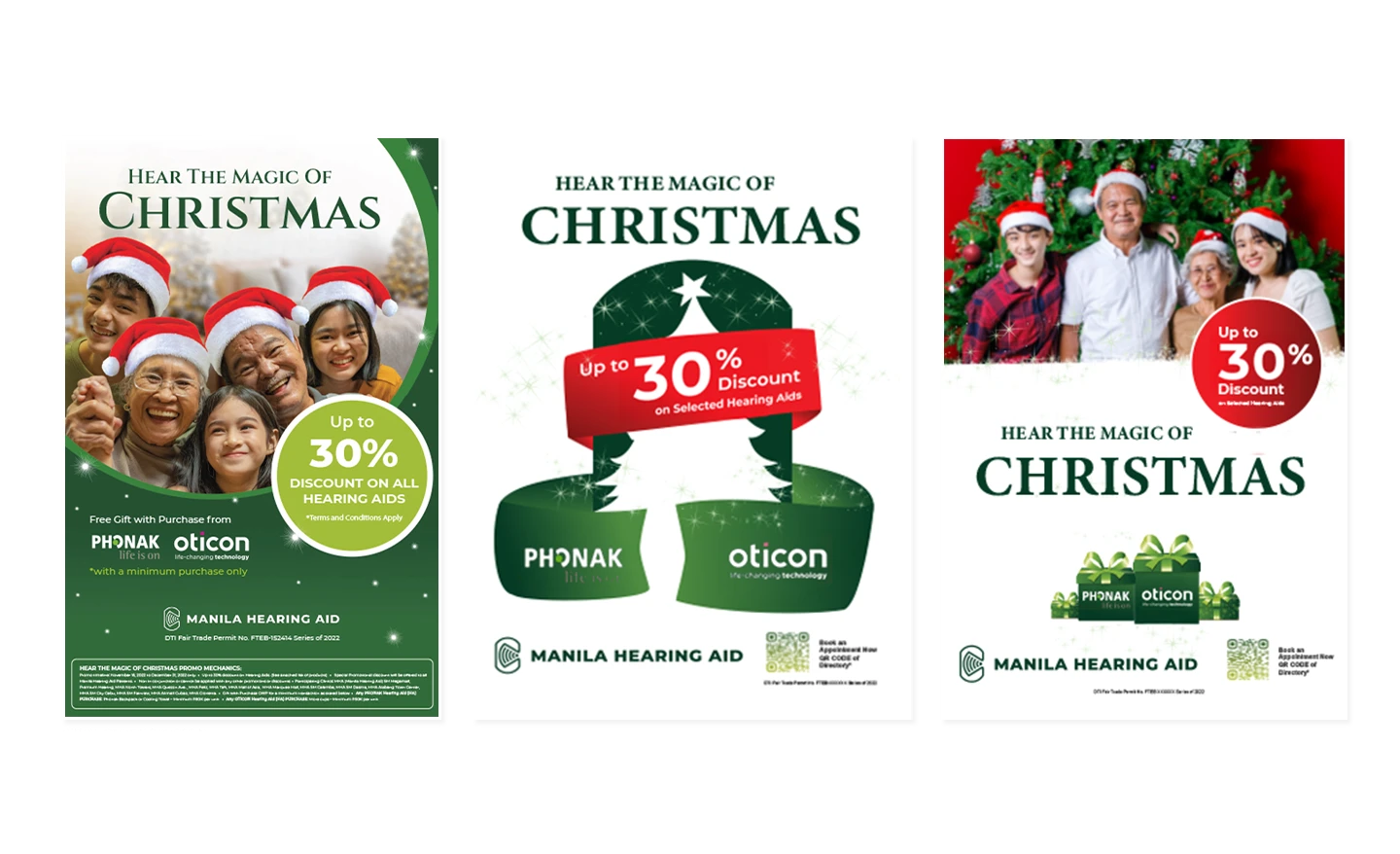
CREATIVE PROCESS
Developed a consistent visual system through
concept exploration, branding alignment,
and adaptable layouts to ensure campaign
consistency across multiple advertising
platforms. →
GOALS & CHALLENGES
The campaign required production one month
before the holiday season and coordination of
marketing materials across 15 clinics, each with
varying display sizes, formats, and placement
requirements.
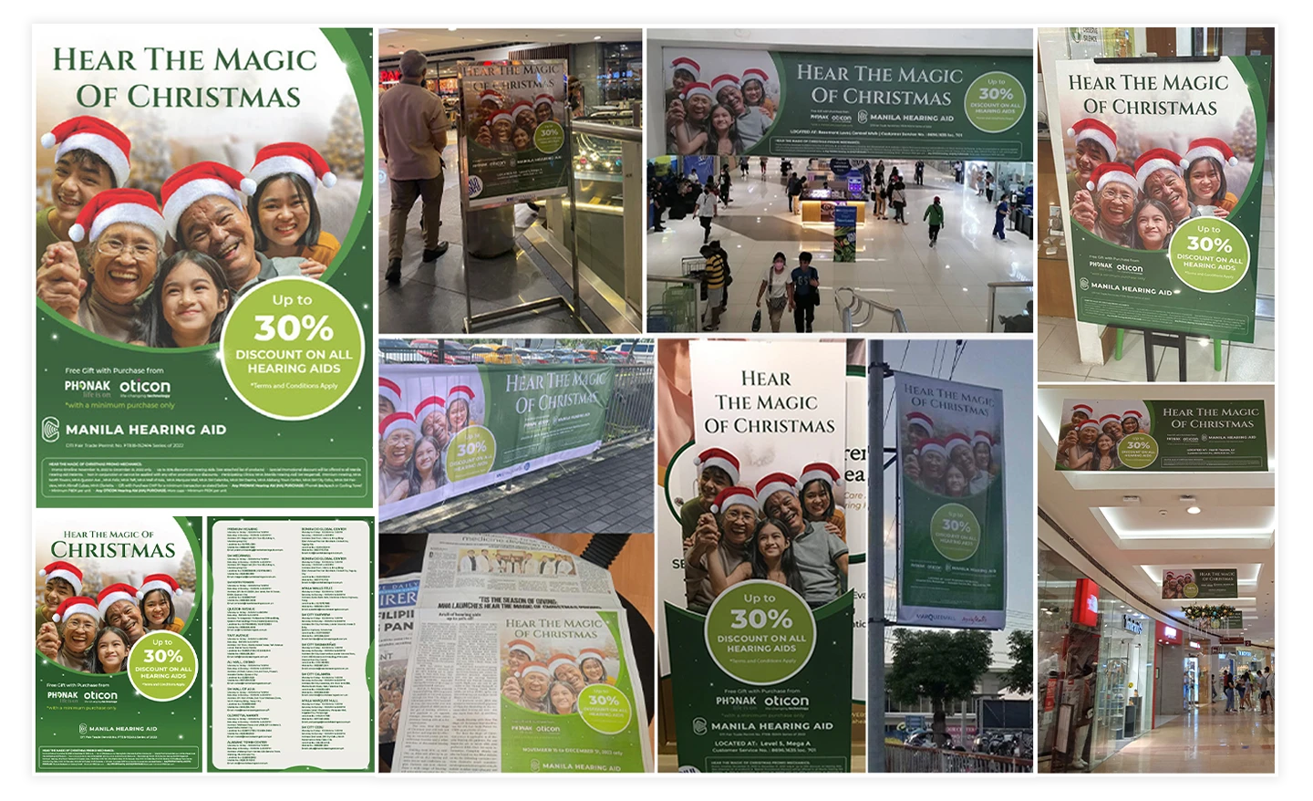
FINAL ARTWORK
Produced a cohesive campaign rollout
including posters, streamers, banners,
LED displays, flyers, newspaper ads,
and social media content while maintaining
consistent branding across all touchpoints.
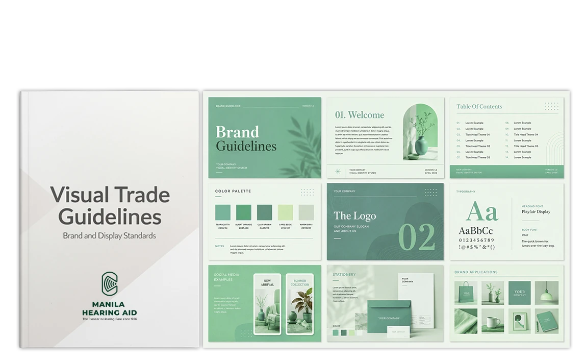
OVERVIEW
To provide a unified framework for all visual
elements used in trade executions.
These guidelines define the proper use of
brand assets, display systems, booth structures,
and merchandising standards to maintain
brand consistency, ensure compliance create
a professional and engaging environment for
customers. To strengthen the brand identity,
enhance visibility, and support the effective
communication of its products and services. →
CREATIVE PROCESS
Developed a structured framework
documenting brand assets, booth systems,
merchandising standards, and visual
applications to create a clear reference
for internal teams, creative partners, and
production vendors. →
GOALS & CHALLENGES
The project required collecting, organizing,
and standardizing multiple marketing
material sizes, display formats, and clinic
requirements while ensuring all executions
remained aligned with company branding.
FINAL ARTWORK
Produced a visual trade guideline
manual available in PDF and ready for
slide presentations format, providing a
scalable reference for consistent trade
execution across all customer touchpoints.
Due to confidentiality, the document content is
obscured. The blurred area highlights the
layout and design approach without revealing
sensitive details.

OVERVIEW
Produced a documentary-style video featuring
the story of a successful singer and actress
who supported her brother’s hearing journey,
and how Manila Hearing Aid became part of
that experience.
The video aimed to emotionally connect
audiences to the brand’s message:
“Hear Life’s Special Moments.” →
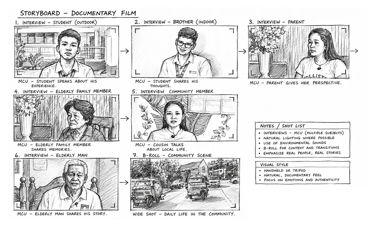
CREATIVE PROCESS
Reviewed the provided itinerary and prepared
the required video and audio equipment for
production. Created a short mood board,
planned interview flow, identified key
interviewees, and listed essential B-roll
shots to support the story.
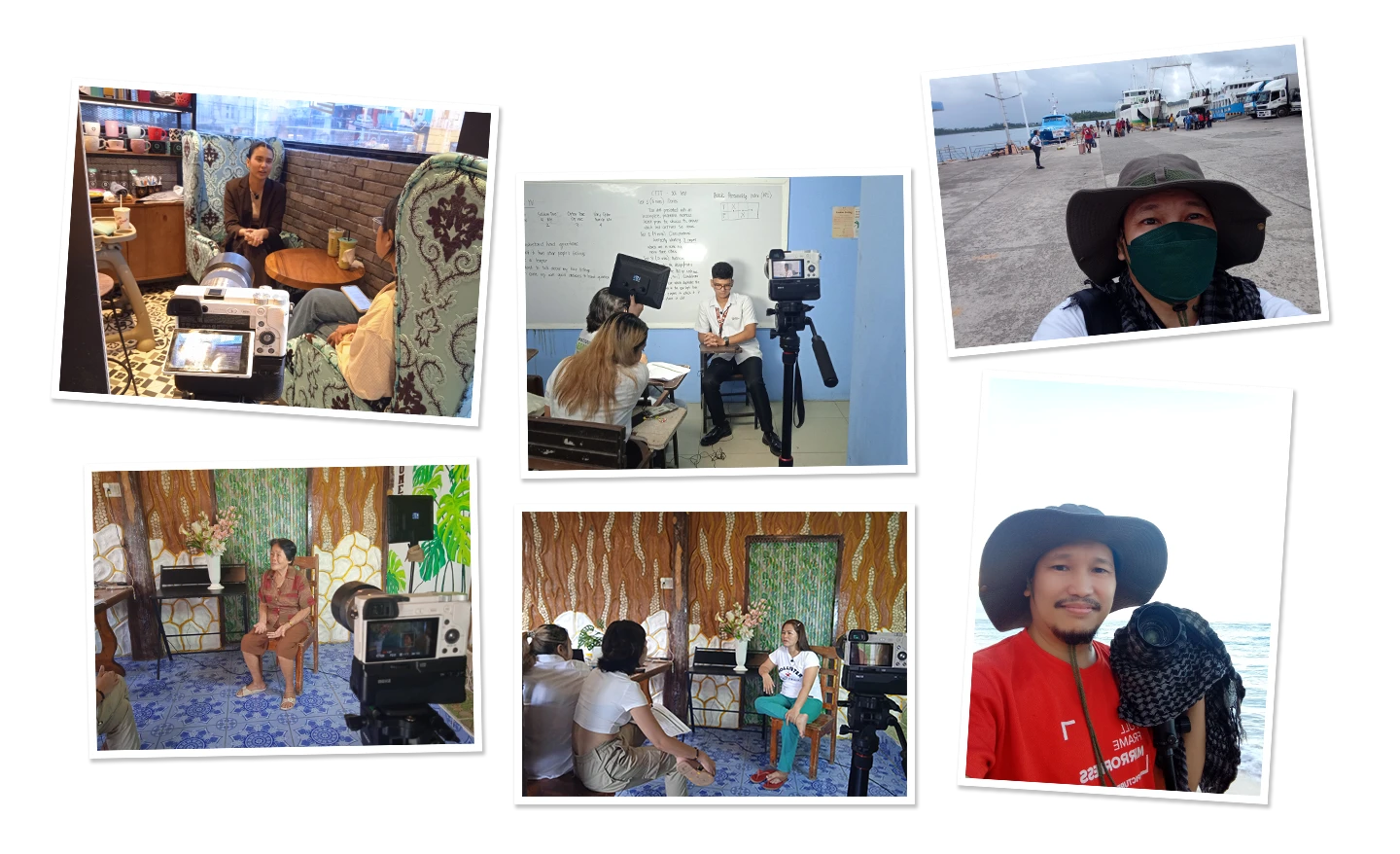
Captured interviews, lifestyle footage,
and supporting visuals while adapting to
schedule and location changes during
production.
Enhanced video, audio, and storytelling
during post-production to create a more
polished and emotional narrative. →
GOALS & CHALLENGES
The goal was to capture authentic interviews
from relatives, teachers, and close friends to
tell a meaningful and emotional story.
Challenges included limited equipment,
unpredictable environments, noisy filming
locations, changing schedules, and
unfamiliar shoot locations that required
quick adaptation.
FINAL OUTCOME
Despite technical challenges such as poor
lighting and inconsistent sound quality,
the video was improved through
post-production and multiple revisions.
The campaign was released as a three-part
video series and gained over 121k Facebook
views, helping reinforce Manila Hearing Aid’s
message: “Hear Life’s Special Moments.”
OVERVIEW
Designed the brand identity for Ultimate Typing,
an online typing-learning platform. The project
began through a freelance job portal as a logo
design request, which later expanded into software
packaging and a landing page, resulting in three
connected design projects. →
CREATIVE PROCESS
Conducted research and competitor review to
understand the market and visual direction.
Using provided assets such as stock photos
and graphic elements, the focus was on
creating a cohesive and consistent brand
identity across all project materials. →
GOALS & CHALLENGES
The goal was to maintain strong visual consistency
and brand alignment across multiple deliverables.
A key challenge was translating the approved
design into functional HTML/CSS and later
adapting it into WordPress.
FINAL OUTCOME
Delivered a fully functional WordPress landing
page with a consistent brand experience across
logo, packaging, and web design.
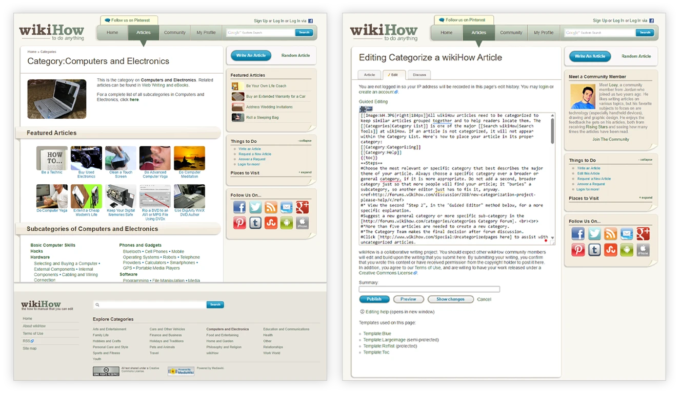
OVERVIEW
Designed and improved the wikiHow article page
through a freelance project focused on interface
enhancements. →
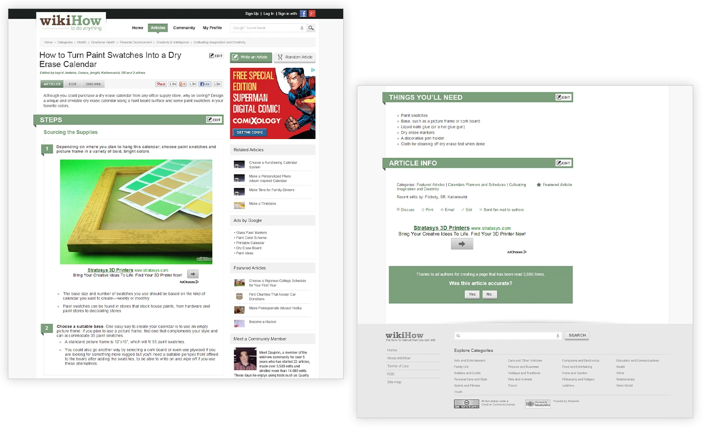
CREATIVE PROCESS
Reviewed the existing article page and improved
key interface elements while maintaining the
original brand identity. →
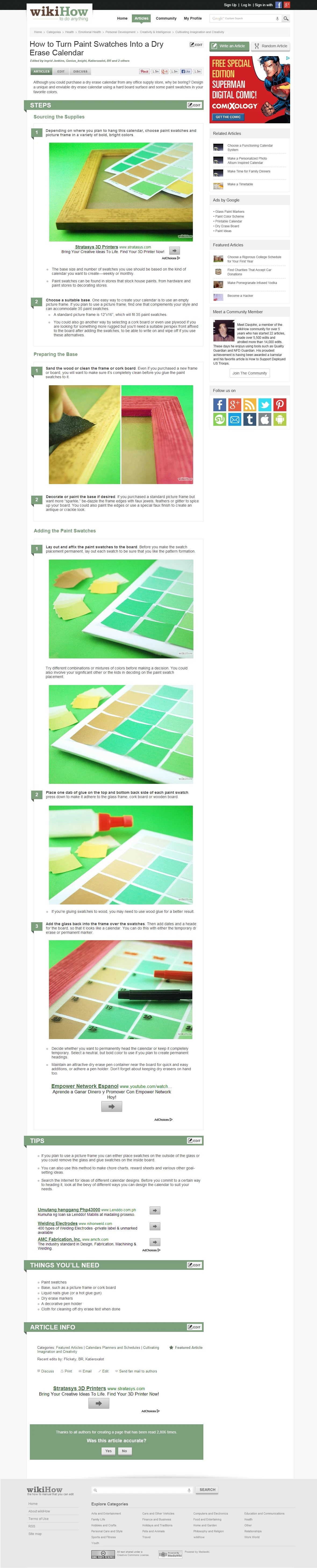
GOALS & CHALLENGES
Enhanced the article page usability and layout
without changing the established logo, colors,
and visual style.
FINAL OUTCOME
Delivered the improved article page with
complete PSD, HTML, and CSS files.

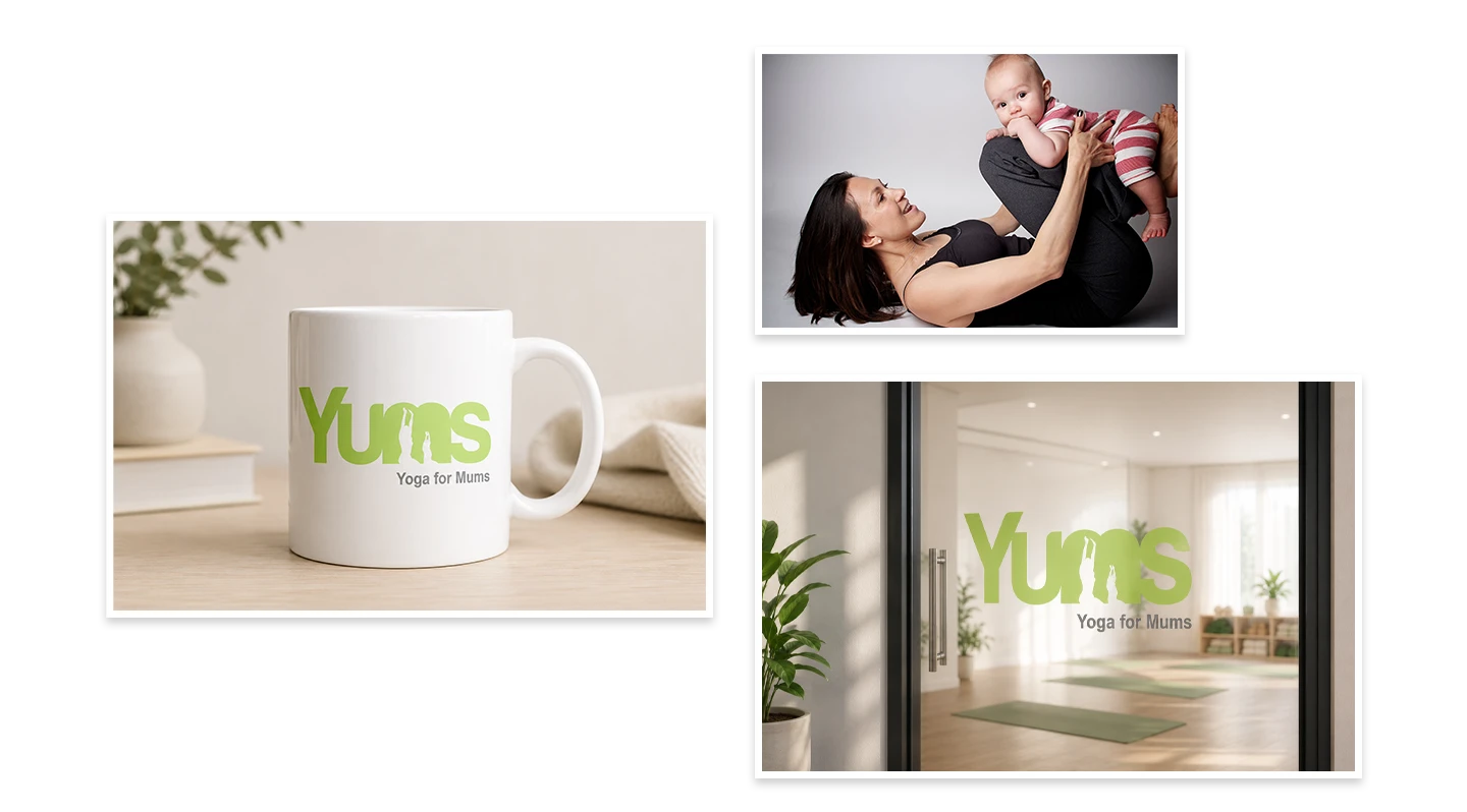
OVERVIEW
Worked on a logo project for an online yoga
brand targeting mothers of all ages a calming
and meaningful identity that reflects wellness,
connection, and motherhood. →
CREATIVE PROCESS
Used the client’s reference photos of mothers
and children practicing yoga as inspiration for
the logo concept. Created an integrated
mother-and-child artwork to reflect connection,
care, and wellness. Chose the Harabara typeface
for a soft and approachable feel, paired with
green tones to symbolize healing, calmness,
and new beginnings. →
GOALS & CHALLENGES
The challenge was to design an identity that
feels relatable to mothers of different ages while
communicating warmth, trust, and mindfulness.
The logo needed to balance simplicity with
emotional meaning. →
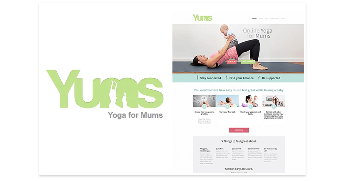
FINAL OUTCOME
Delivered a visual identity that captured the
brand’s purpose and resonated with the client.
The positive response led to a second project
opportunity to design the website.
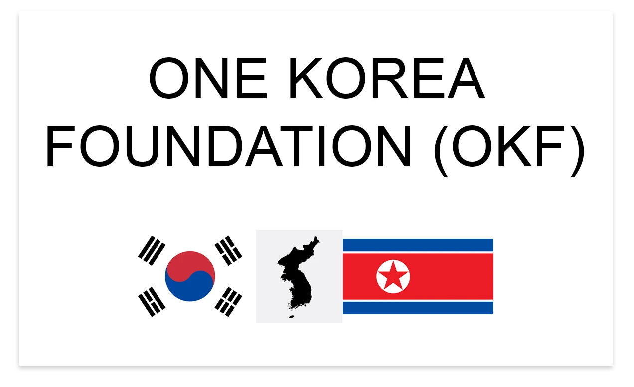
OVERVIEW
Designed a logo for One Korea, a movement for
the peaceful reunification of Korea. The project
started through a logo design contest. My
proposal was selected as the winning design,
followed by logo files and basic brand
guidelines. →
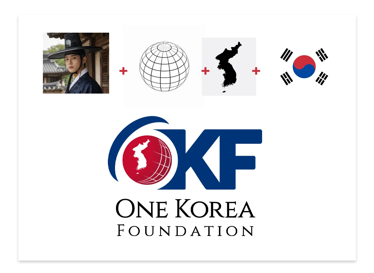
CREATIVE PROCESS
I used the Korean flag as inspiration for the color
palette. A globe and the Korean peninsula became
the main visual elements. I also explored Korean
symbols like the Gat to add cultural meaning while
keeping the design simple. →
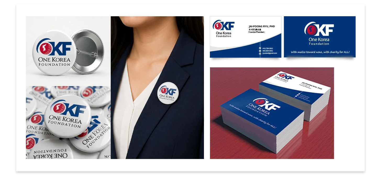
GOALS & CHALLENGES
The goal was to create a simple and trustworthy
identity. The challenge was balancing peace,
unity, and cultural relevance in a clean design. →
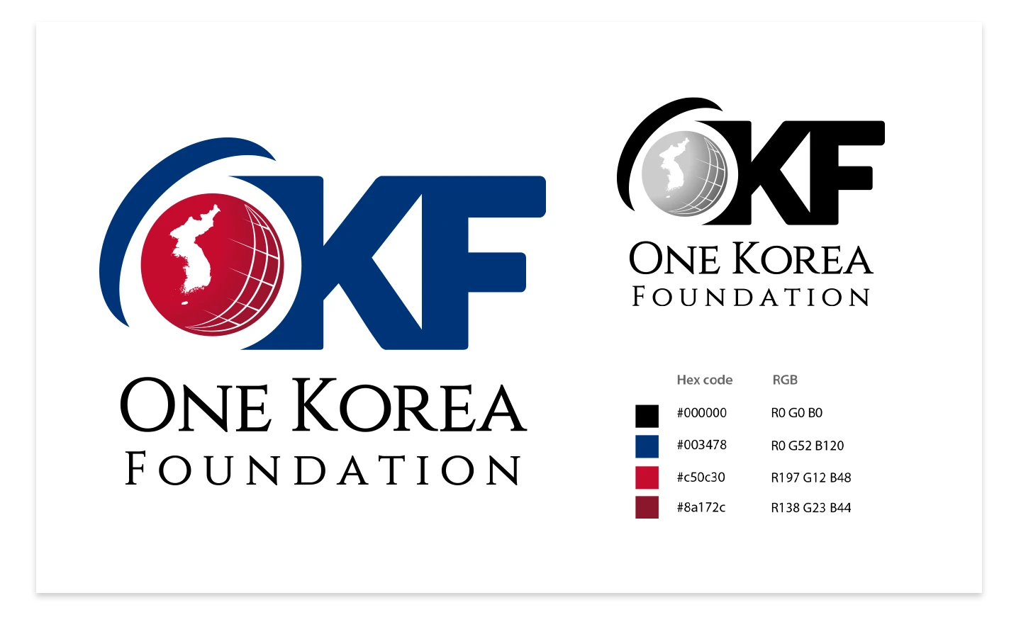
FINAL OUTCOME
The final logo reflected unity and trust.
The design won the contest and all
source files were delivered.
OVERVIEW
I was assigned to capture B-roll and
behind-the-scenes footage for a restaurant ad,
XBISTRO Laboratory featuring Krizzle Luna,
with all instructions given on the spot.
OVERVIEW
I worked on this project without any specific
instructions—my boss simply asked me to
shoot the place to see what I could come up
with. Since my background is in photography
and graphic design, this became my first gig
as a videographer. The challenging part was
getting familiar with the equipment right away;
I’m used to Canon and Sony cameras, but this
was my first time handling a Lumix GH5 and
working with a gimbal.
OVERVIEW
A short interview clip with a legal expert providing
advice. The interviewee was given a prepared
script to read, and my role was to select the
location, set up the equipment, and handle
the shoot. I also managed the post-production
process. The challenging part was producing
the material within the same day.
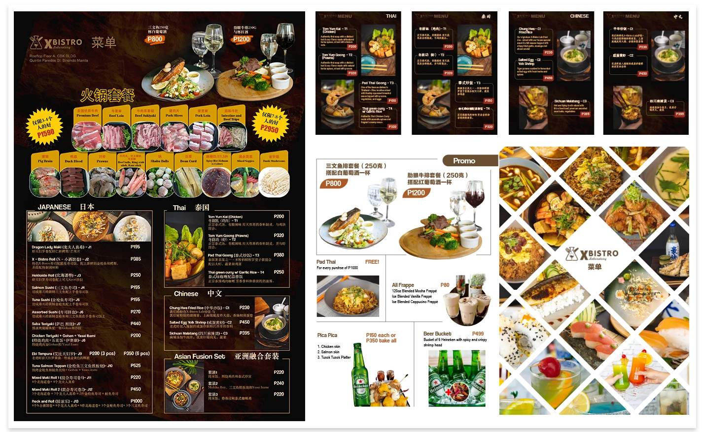
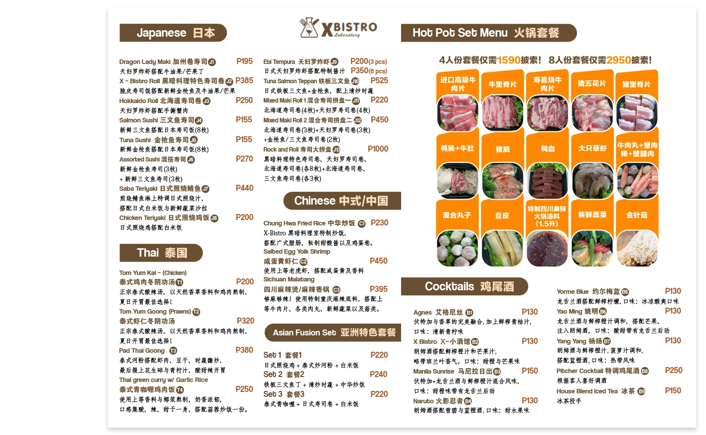
OVERVIEW
The work involved food photography for featured
meals used in menus, flyers, digital displays,
and social media content. The project also
required English and Chinese versions of
the materials. →
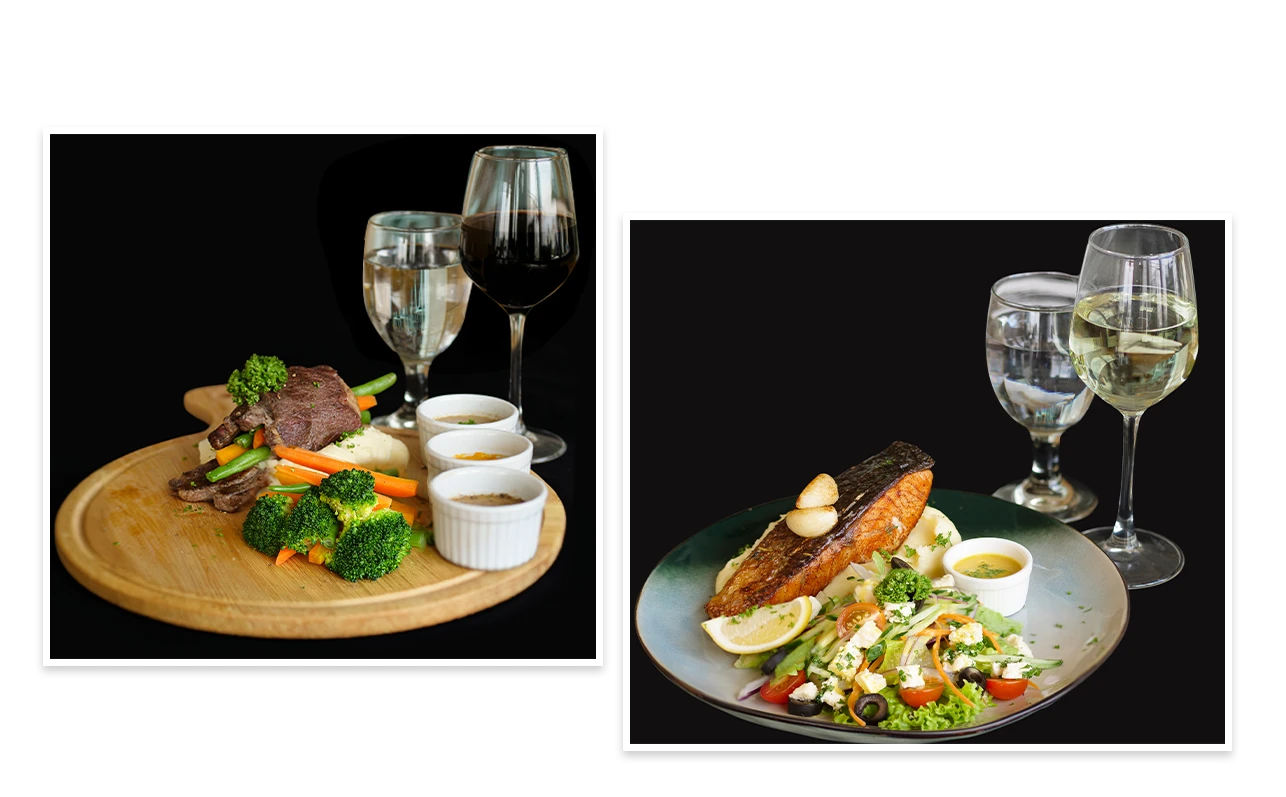
CREAITVE PROCESS
I started by photographing featured meals for
promotional use. After the shoot, I enhanced the
images through post-production. I then designed
menus, flyers, digital display videos, and social
media graphics using the final food photos. →
GOALS & CHALLENGES
The goal was to create appealing visuals for
restaurant promotions across different platforms.
The biggest challenge was translating content
into Chinese accurately. Initial translations
required proofreading and corrections from
Chinese colleagues before final production. →
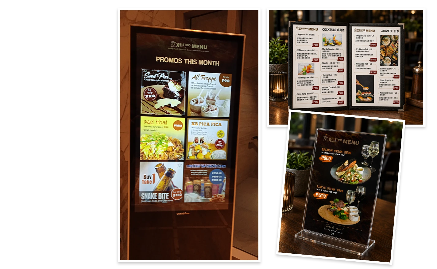
FINAL OUTCOME
The marketing materials were completed
successfully. The final designs were distributed
across menus, flyers, digital displays, and social
media platforms of the restaurant.
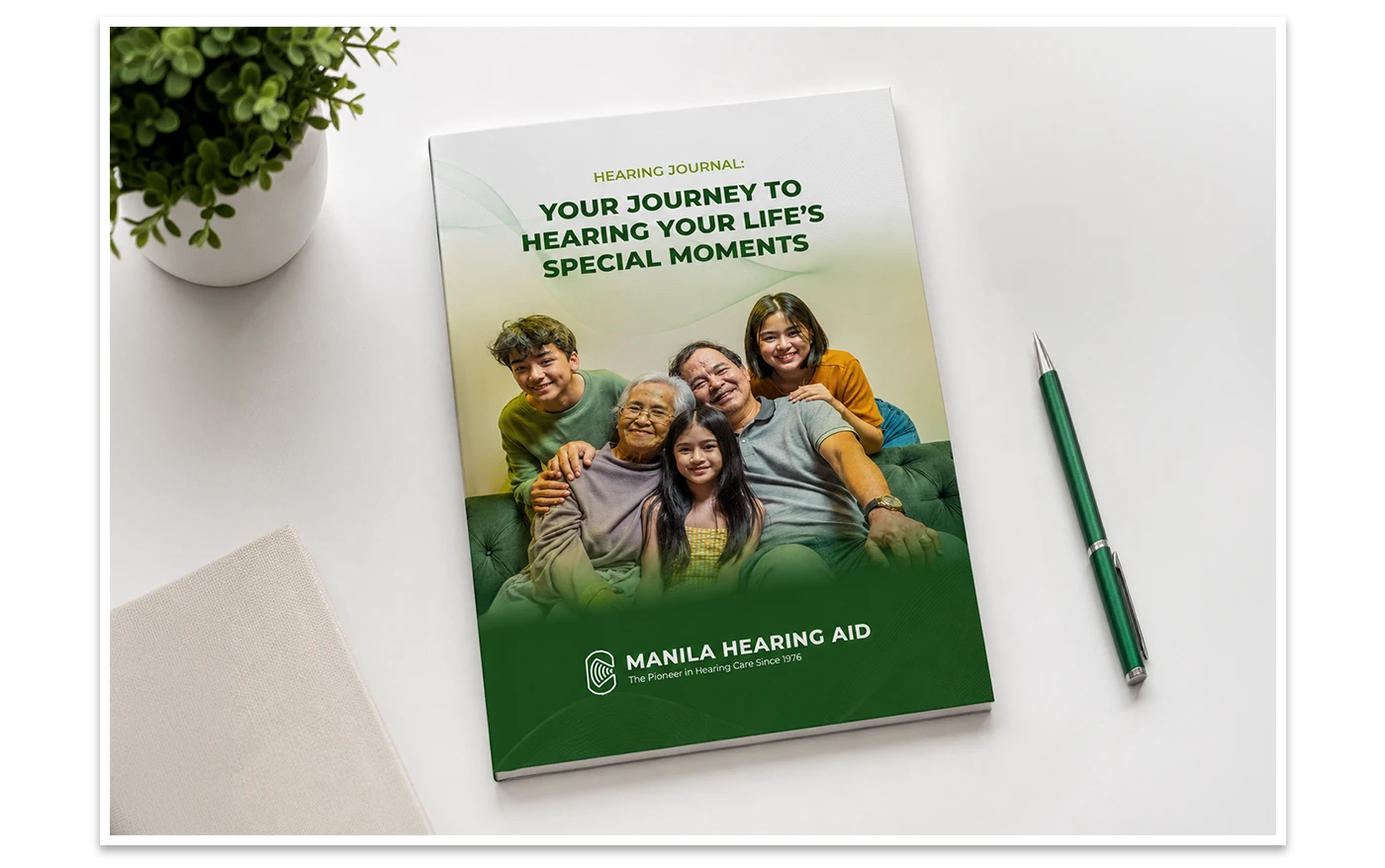
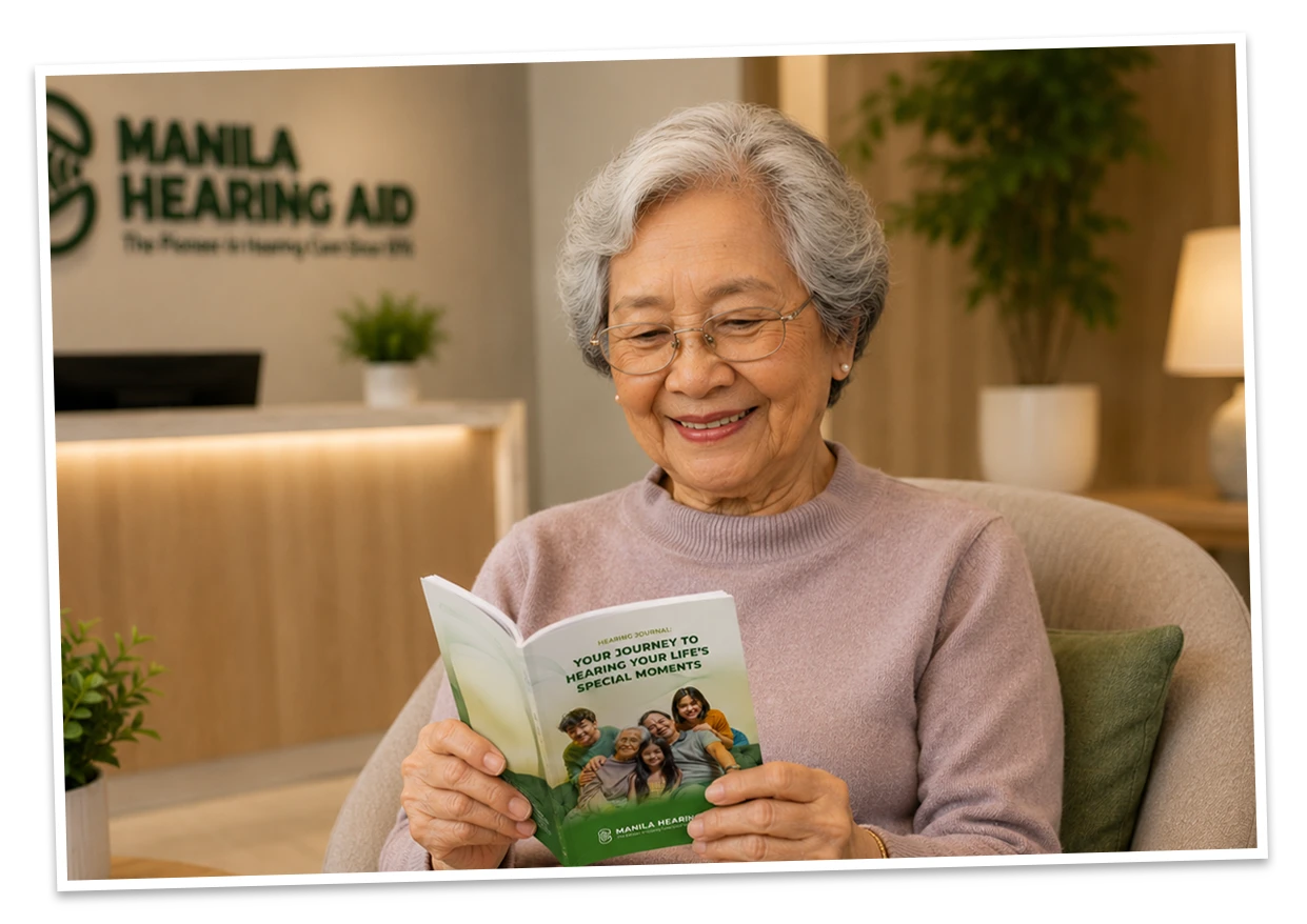
OVERVIEW
Designed a patient guide booklet for hearing
aid users. The booklet provides product
information, usage instructions, care guidelines,
and follow-up records to help patients
maximize their hearing aid experience.
The project included content organization,
visual design, and production of a print-ready
publication. Based on the Manila Hearing Aid
Hearing Journal booklet. →
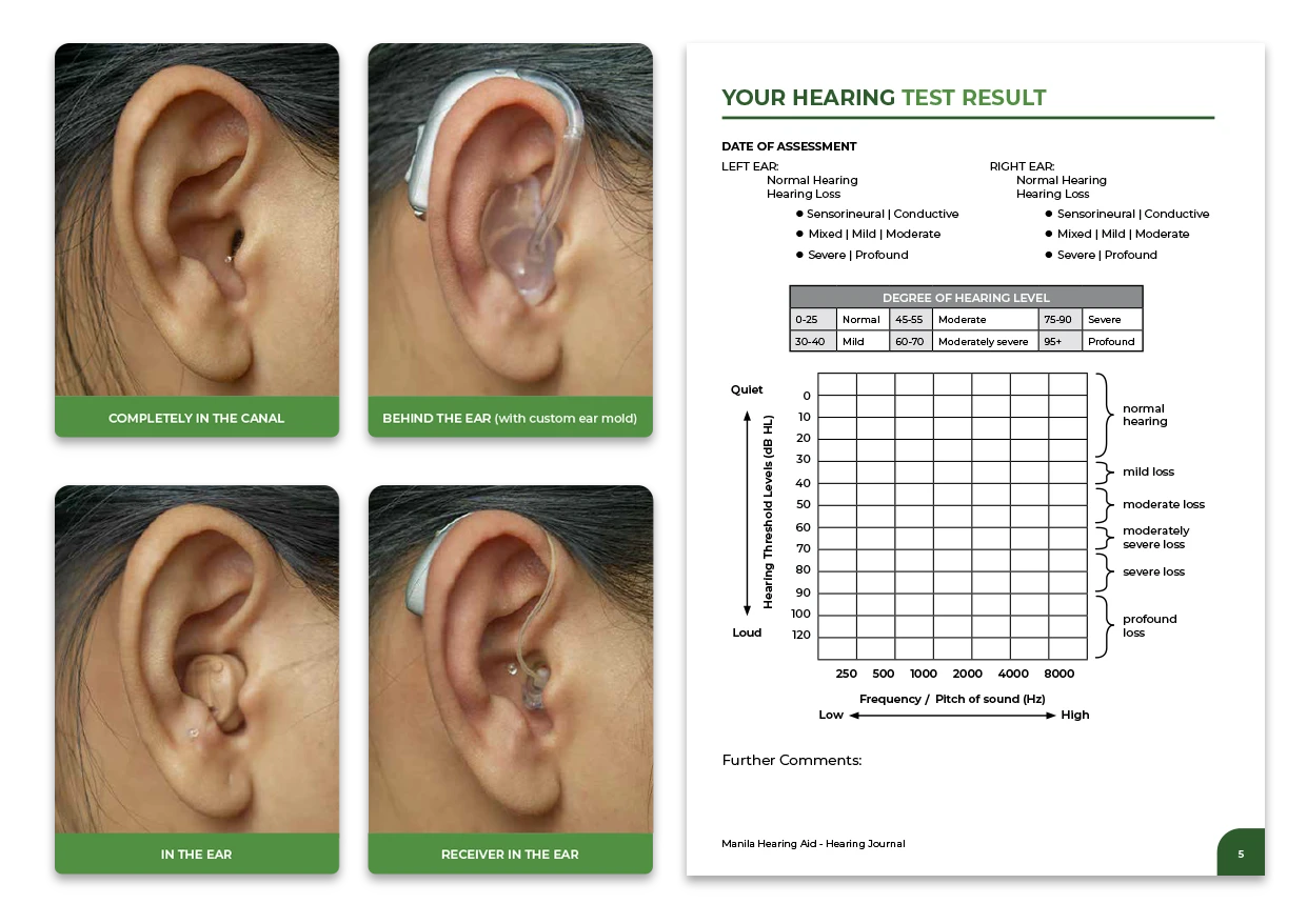
CREATIVE PROCESS
Collected and reviewed all content, product
information, and supporting materials. Verified
that all information was current and accurate.
Studied the company’s existing branding
guidelines to maintain visual consistency across
the publication. Created graphics and supporting
visual elements before designing the final layout
in Adobe InDesign. Organized the content into
clear sections with a strong visual hierarchy and
easy navigation. →
CREATIVE PROCESS
The goal was to create an informative and
user-friendly guide that helps patients
understand and care for their hearing aids.
The design needed to align with the company’s
established brand identity while remaining
clean and professional. The main challenge
was presenting detailed information in a
simple and highly readable format for an
elderly audience. Careful attention was given
to typography, spacing, contrast, and layout
to improve readability and accessibility. →
FINAL ARTWORK
Produced a professional, brand-consistent
booklet in a print-ready PDF format. The
document was prepared for commercial printing
and distributed to hearing clinics as a patient
reference guide. The final design improved
information accessibility, reinforced brand
identity, and provided patients with a clear
resource throughout their hearing aid journey.
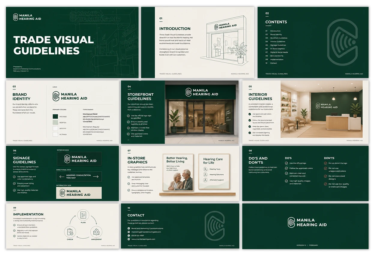
OVERVIEW
Redesigned and enhanced the company’s
Visual Brand Guidelines booklet by rebuilding
the original PowerPoint-based document in
Adobe InDesign. Updated the color palette,
refined the layout, and applied new design
elements to create a more professional,
consistent, and brand-aligned publication.
Due to confidentiality, the document content is
obscured. The blurred area highlights the
layout and design approach without revealing
sensitive details.
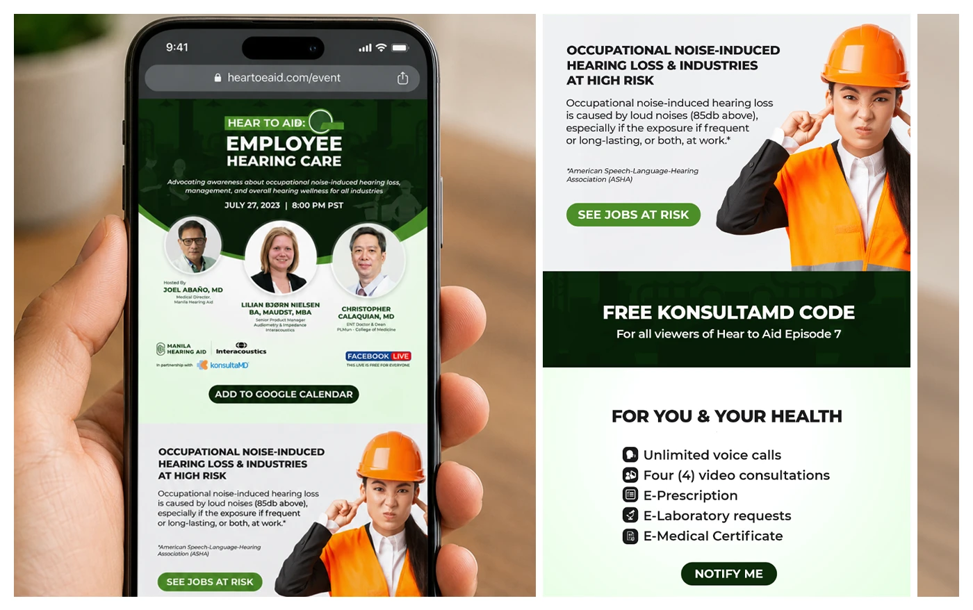
OVERVIEW
Marketing campaign requirements and key
visuals are first reviewed. The EDM design is
then adapted from the approved social media
artwork, with the layout resized and optimized
according to Mailchimp specifications. →
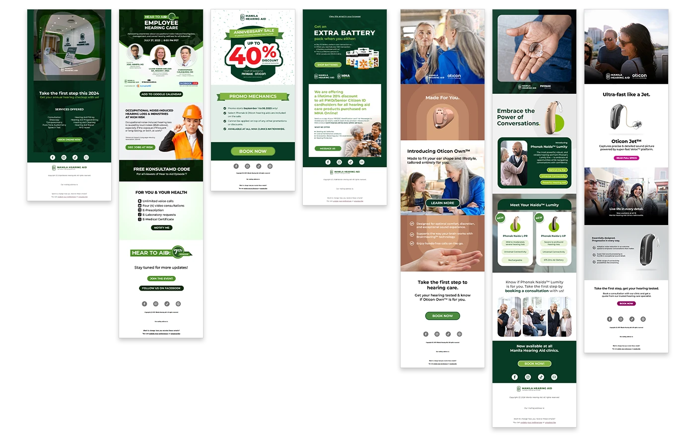
After final quality checks and revisions, the
completed artwork is submitted to the Social
Media Specialist for distribution to members
and subscribers through the mailing list.
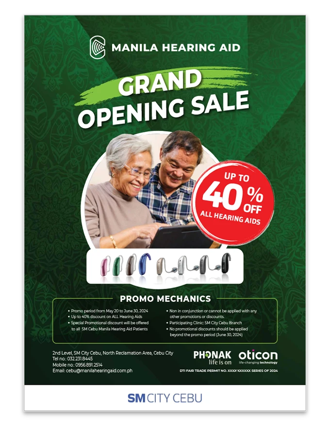
OVERVIEW
A marketing campaign was created to promote
Manila Hearing Aid’s new clinic in Cebu City
and its grand opening offer of up to 40% off
premium hearing aids. The design incorporated
Sinulog-inspired textures and cultural elements
to connect with the local audience while
maintaining brand consistency.
CREATIVE WORKFLOW
The campaign began with designing a poster
that established the main visual theme and
messaging. The approved design was then
adapted into multiple print and digital formats
while ensuring a consistent look across all
materials. →
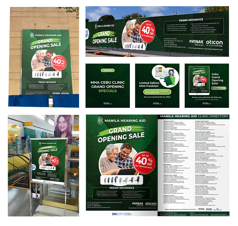
FINAL OUTCOME
A cohesive campaign was successfully produced
across various marketing channels, increasing
visibility for the new Cebu clinic and its
promotional offer. Final artworks included a
poster, billboard, streamer, flyers, and social
media campaign materials.
A testimonial video featuring Angelica Bailon,
a long-time Manila Hearing Aid patient,
sharing how hearing aids helped her pursue
her dream of becoming a lawyer. The video
highlights her inspiring journey and the positive
impact of hearing care on her life.
The interview was conducted in an office setting
using a minimal lighting setup. The video was
filmed as a straight forward talking-head
interview without B-roll footage to keep the
focus on Angelica’s message. The final edit was
produced in line with Manila Hearing Aid’s
branding and testimonial campaign goals.
A testimonial video featuring Francisco Barretto,
an entrepreneur and family man, sharing how
the Phonak Audéo Infinio Sphere enhances his
daily life. The video highlights the product’s
ability to provide clear conversations,
adaptability, and confidence while promoting
its real-world benefits through his personal
experience.
The interview was conducted at one of Mr.
Barretto’s restaurants in Subic, Olongapo City.
Additional outdoor B-roll footage and shots of
his businesses were captured to provide context
and support his story. The final edit combined
the interview and supporting visuals to showcase
the impact of the Phonak Audéo Infinio
Sphere in his everyday life.
Produced a short video clip each month as part
of the report, highlighting all the projects
completed during that period. Here are few.